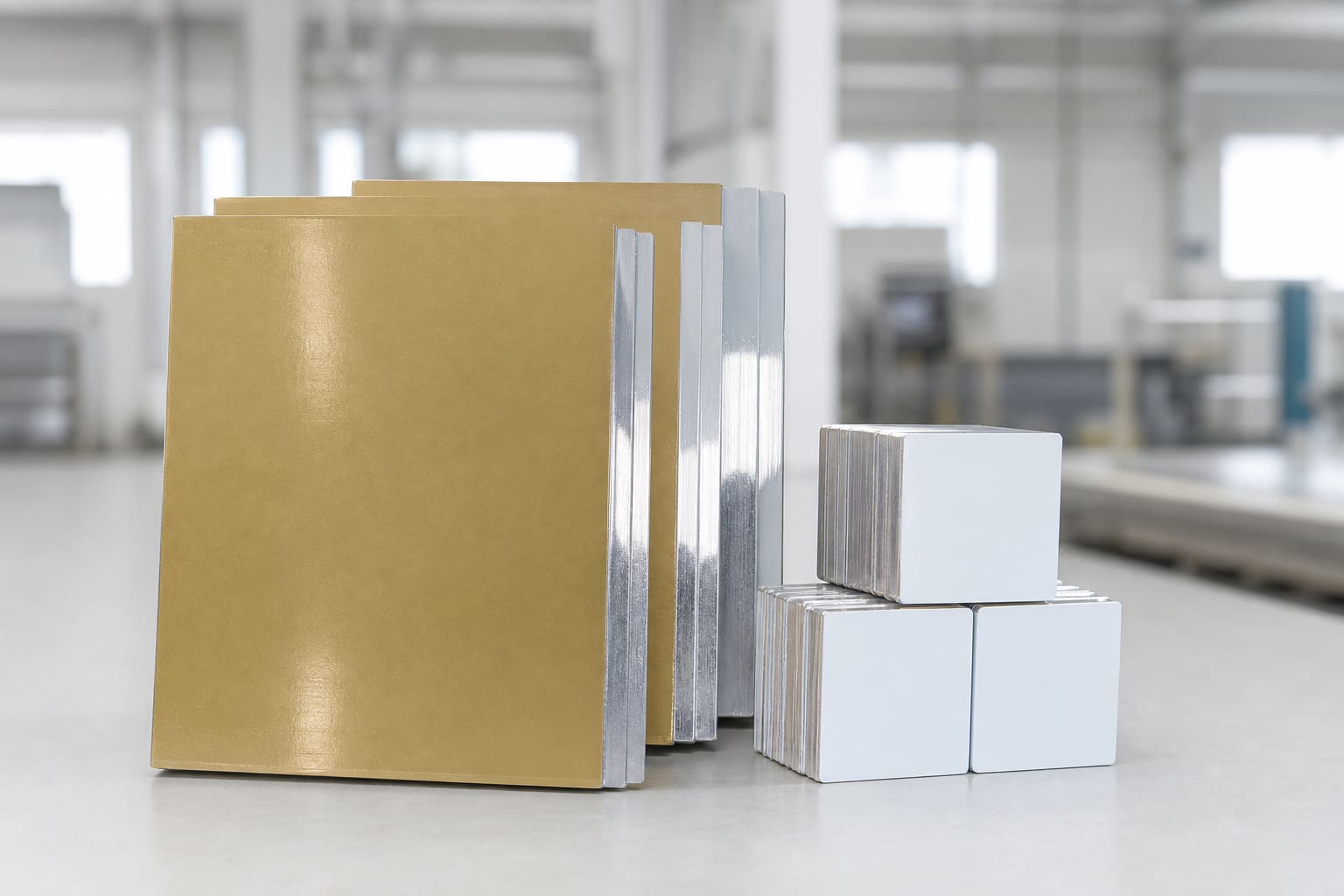
Gloss: strong color with visible reflections
Gloss surfaces often make dark tones and saturated color appear visually deep. They suit photographic work and displays where controlled lighting allows the reflective finish to be appreciated.
The tradeoff is glare. Windows, spotlights and bright overhead fixtures can obscure parts of the image. Fingerprints and handling marks may also be more noticeable.
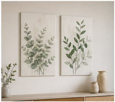
Matte: controlled glare and practical viewing
Matte surfaces scatter reflections and can be easier to view in offices, corridors, signs and rooms with uncontrolled light. Fine detail remains available, but the image may feel less glossy or less contrast-heavy than a high-gloss sample.
Matte is not automatically dull. The correct comparison is a printed sample viewed in the intended environment.
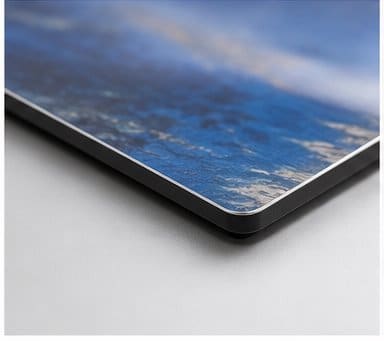
Brushed or clear: the metal becomes part of the artwork
On a clear-coated brushed panel, unprinted and lightly printed areas can reveal the aluminum grain. This is useful for industrial graphics, monochrome work, metallic accents and artwork designed around negative space.
It is less predictable for pale skin tones, white clothing, wedding images or brand colors that require an opaque white base. White in the source file generally becomes the visible substrate rather than white ink.
A simple finish test file
Use one controlled file to compare finishes. Include a grayscale ramp, a neutral gray patch, saturated red, blue and green, a skin-tone image, small black text, a soft sky gradient and a region intended to remain white.
Photographing samples is not enough because cameras and screens alter reflections. Review the actual panels beside each other.
Match finish to use
For consumer photo prints, offer a clear explanation of reflection and metallic effects. For wholesale programs, record finish names and codes carefully; terms such as satin, semi-gloss and matte are not identical across suppliers.
- Portraits and predictable whites: start with white-coated samples.
- Bright rooms and wayfinding: test matte or reduced-glare options.
- Metallic art and industrial branding: test clear brushed surfaces.